How Colour Affects the Way Your Home Feels
You've probably walked into a room and immediately felt relaxed - or restless, or suddenly hungry - without knowing why. A big part of what's driving that? Colour.
Researchers have spent decades studying this in hospitals, schools, and restaurants. The findings are consistent: colour has a measurable effect on how we feel, physically and mentally.
Different rooms, different jobs
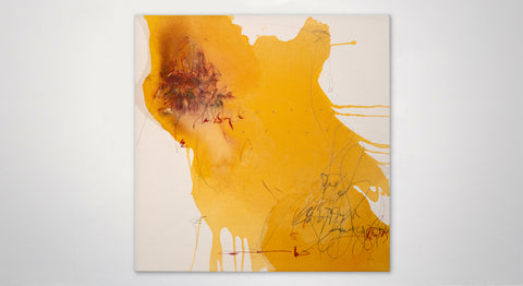
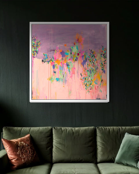
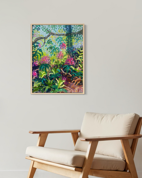
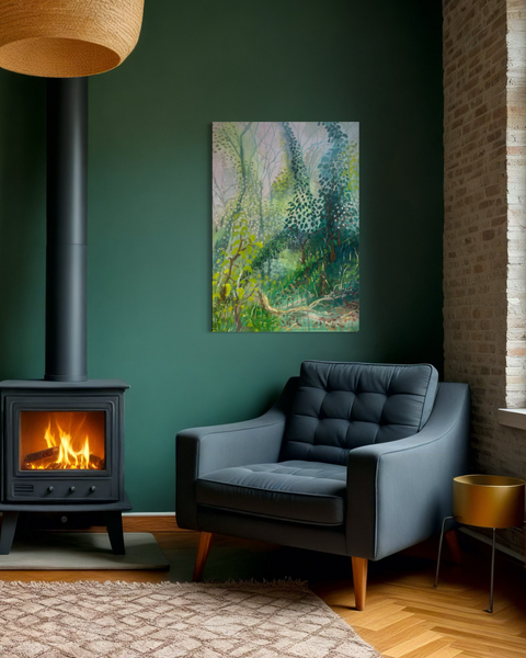
Living Room
Warmth and energy. Reds, oranges, and ambers raise energy levels, make spaces feel physically warmer, and get people talking. Earthy terracottas do the same job with a bit more subtlety.
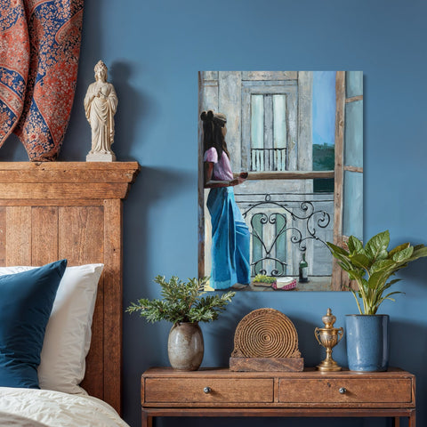
Bedroom
Calm, above everything else. Blue slows your heart rate and lowers stress, making rooms feel bigger and quieter. Blues, blue-greens, and soft mauves are your friends here. Probably not the place for something bold or high-contrast.
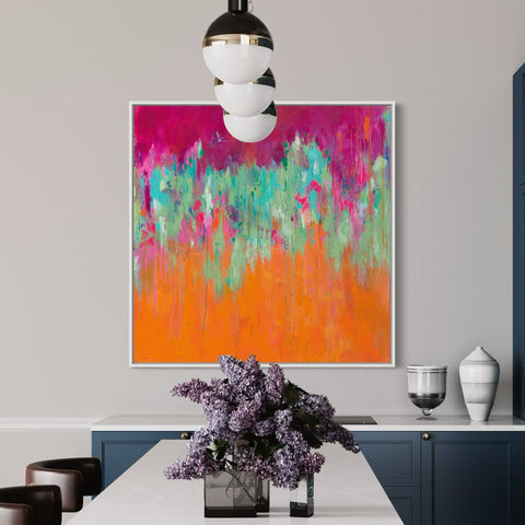
Kitchen and Dining Room
This is where bolder colour earns its place. Warm yellows, amber, and red-orange make food look better and conversations feel livelier. They also stimulate appetite - hence why so many restaurants lean into them.
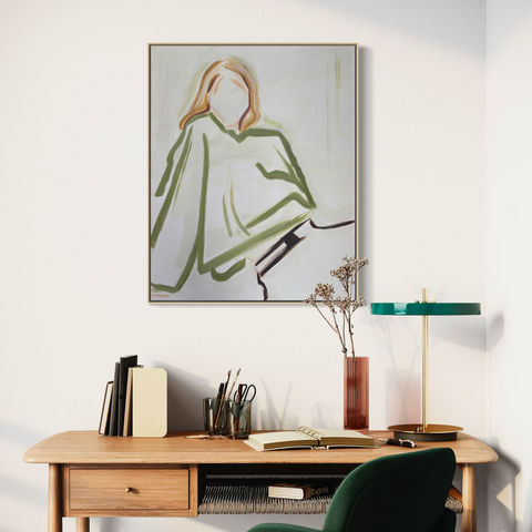
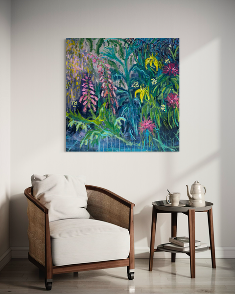
Home Office
Engaged, not distracted. Green is the easiest colour for your eyes to process, reducing stress while keeping you alert. More structured, restrained works in greens tend to support focus without tipping into chaos.
And wherever you are in the house: warm neutrals - creams, taupes, soft whites - give your brain a rest. Less visual noise means less mental effort. A good base for any room.
Where art comes in
find your perfect piece